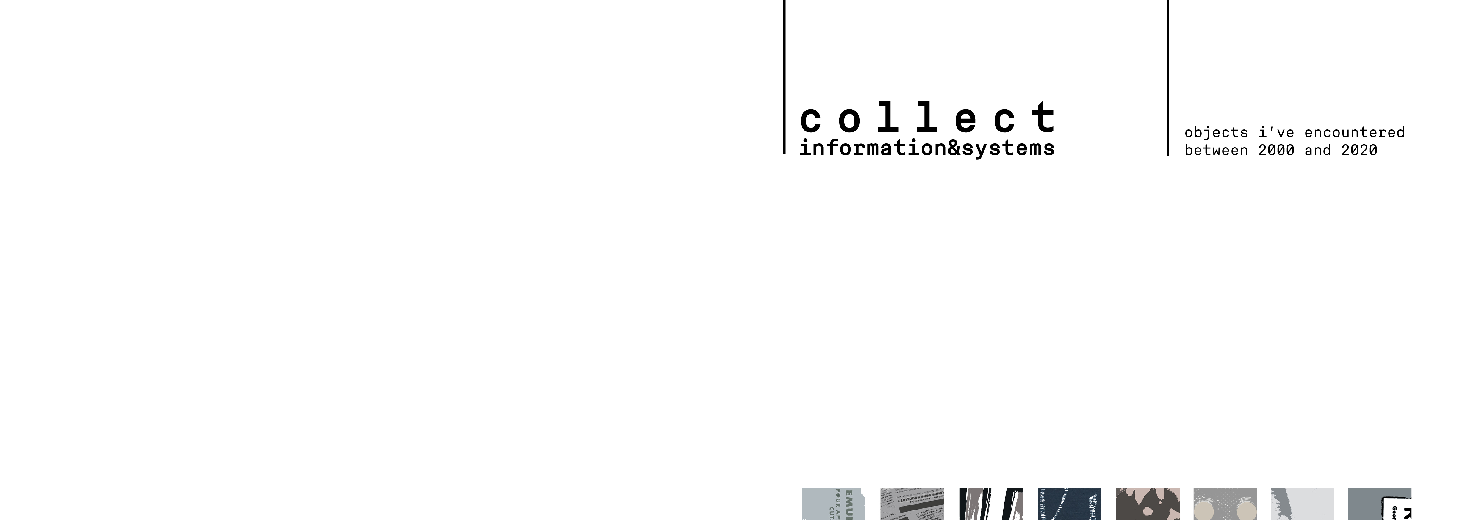
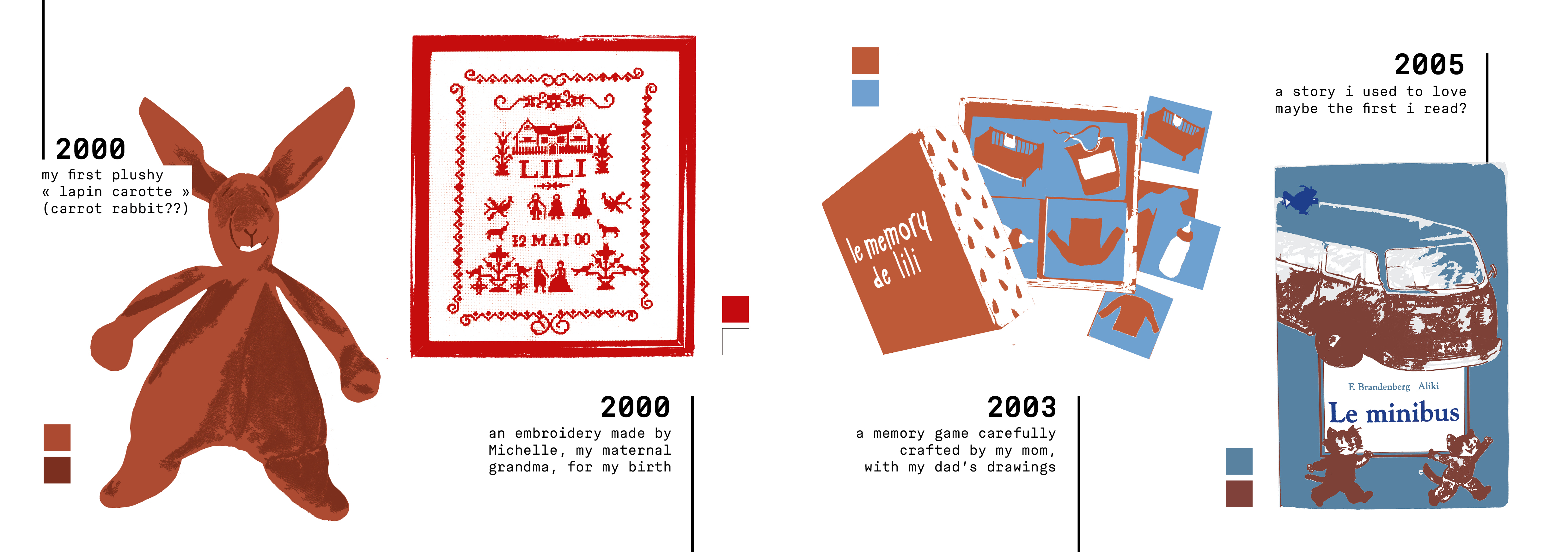
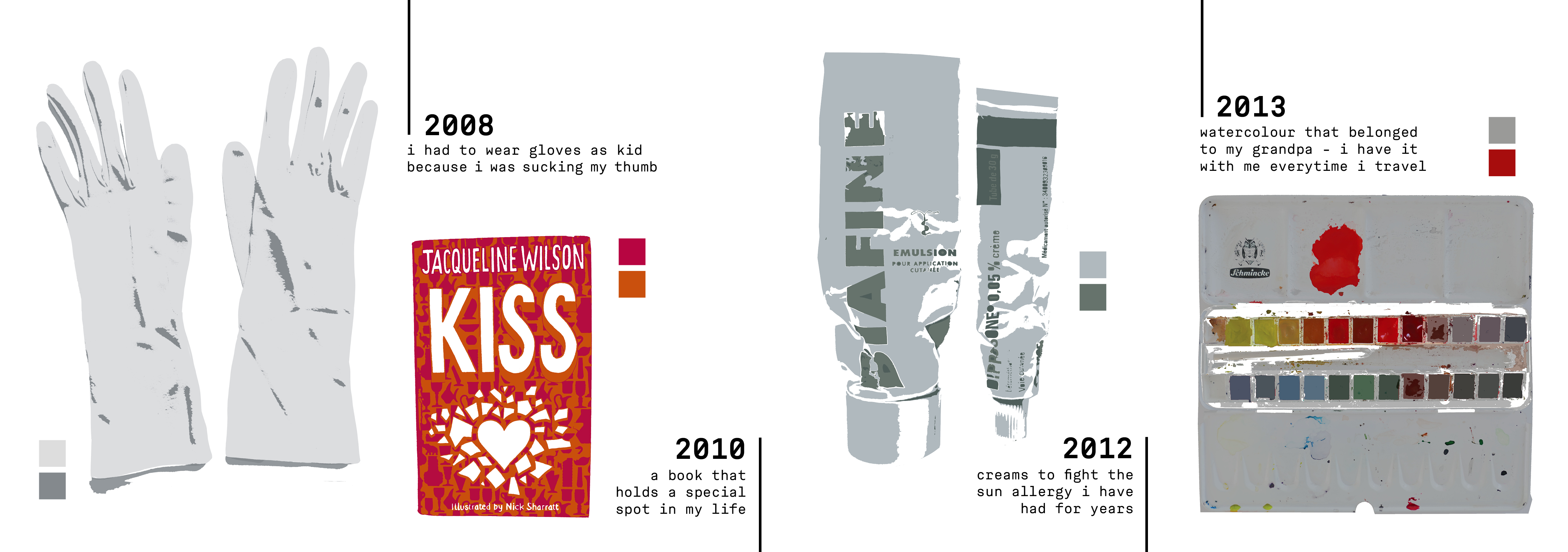
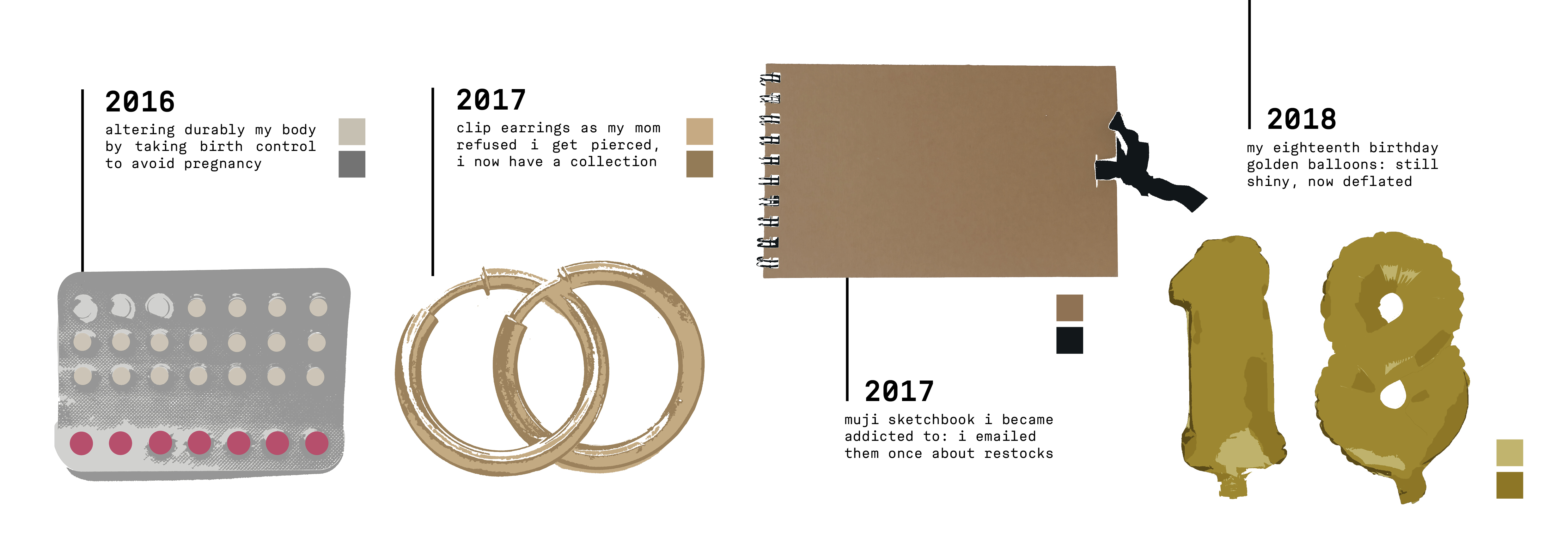
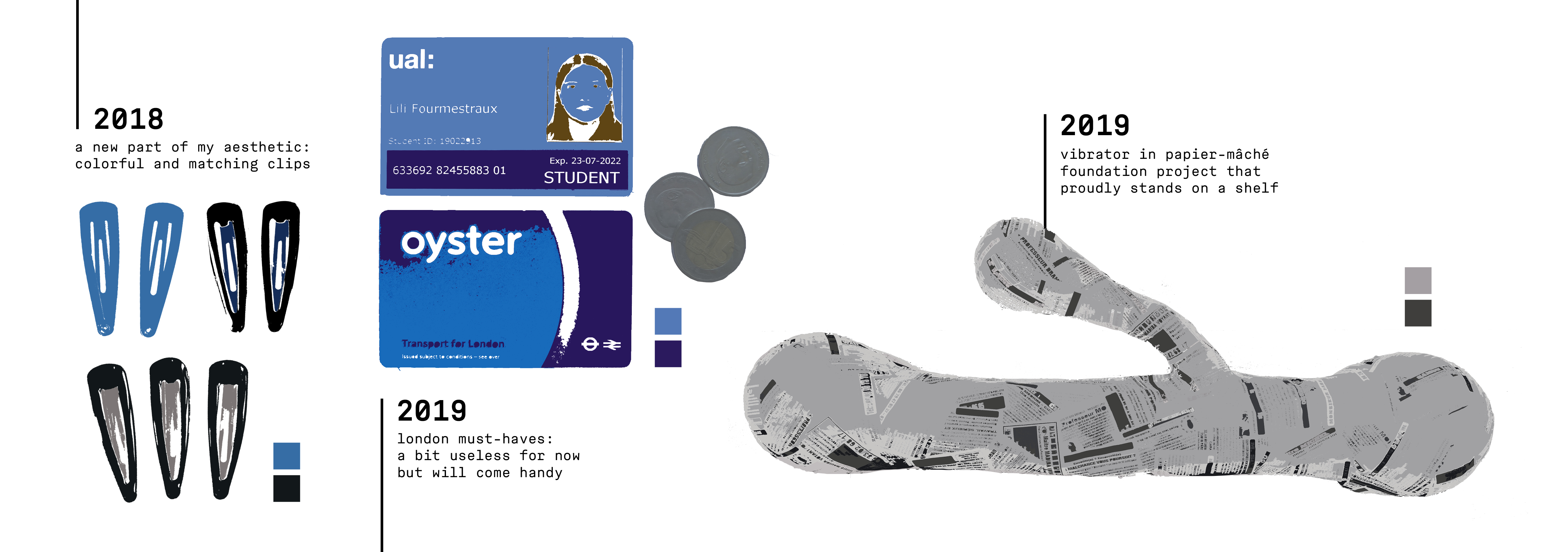
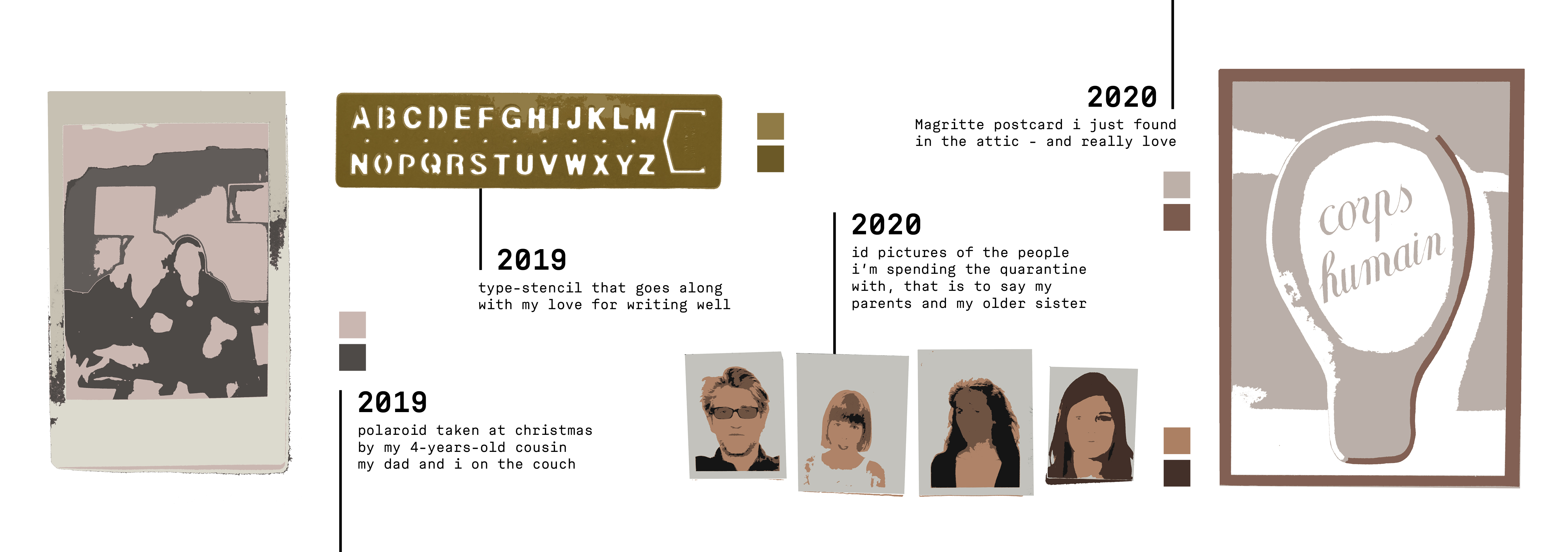
Currently quarantined, I am not home but in a countryside house where a lot of things from my childhood and teenage years have been moved (toys, books, clothes…). I created a chronology of my life through these objects. All the images are clickable if you want to take a closer look! or you can access the project presented as a pdf here


a little mock-up as i thought it would make sense printed as a concertina for a frieze/fresco style (but i have no printer right now)

Beautifully laid out! The timeline is a great idea and really clearly portrays how you’ve chosen to “organise” your objects. I found it particularly hard to display my items in a way that is graphically pleasing, however you’ve done a great job of doing that. It looks like you’ve imaged traced them to give them a similar look and style, which is a nice way to bring them all together to produce a clean and clear concertina. I think the comments are a great way of giving us a bit more information that relates to each item you’ve chosen. I don’t think theres much I can say that would improve the work you’ve produced this week- great piece of design produced from a very broad brief!
I love how you took the extra step to illustrate the items, it’s very visually attractive and gives the whole project a sense of cohesion – it also makes the objects seem more personal. I also think that ordering by time most closely represents the message you’re trying to convey – it makes us experience your whole life with you.
Suggestion/ idea you could explore – you could experiment with the illustration style based on your age e.g – making the older items (like the plushy bunny) more abstract/ animated and as your get older, the illustrations could become more realistic – representing the idea that you remember the recent memories/items more clearly.
Our brief was extremely broad and I feel like you really done well with narrowing it down to something you were interested in! I love the layout of the mock up publication, and agree that it would work for the timeline theme that you’ve chosen. (Unsure on where this brief is heading for us all but…) maybe you could consider adding the places in which these items were found? Like i said, it’ll depend what they have in store for us next week but maybe for the note you wrote your mum you could take a photograph / illustration of it on her desk. Lastly, I think the illustrated effect is beautiful and adds another dimension to your approach!
Hi Lilli,
The whole piece has a really consistent aesthetic (empahsized by the illustrative style used) and its really nice how you the mock up to show what the outcome would look like in a printed context. I also really like how you’ve combined each LATCH letter in it in a way thats easily communicated. Like when I skimmed through w/o reading I could see that it was in a way organised by colour (somewhat?) and then when I looked closer, there was also time as well! The annotations/stories behind the objects are really fun to read as well – it makes them more distinctive and personal. It is such an interesting and personal way to tackle the given brief and like Laura, I can’t really think of ways you could improve it but you could consider-what would it look like with more parts of LATCH incorporated! Sorry for the late reply and I hope you have a pleasant evening!
A strong concept very well put together, especially given the timescale. The personal aspect is very good and the whole project reveals a lot about you. The timeline is the obvious organisational method for your idea and the design is very clear so it communicates this effectively. It would be interesting to see if you could apply any other organisational approaches to your objects as well such as Hierarchy.
The illustrations are very good and great use of colour.
Even though the projects clearly communicates your idea you were meant to load your process work for feedback as well.