after task 1 and task 2, i felt like i’d talked enough about my life and childhood. which is why i decided to work on something rather different for this week. i crafted and curated the leaflet of a virtual exhibition, and associated my 26 objects with fictional testimonies, from other voices than mine.
the full pdf is accessible here. research/process is here
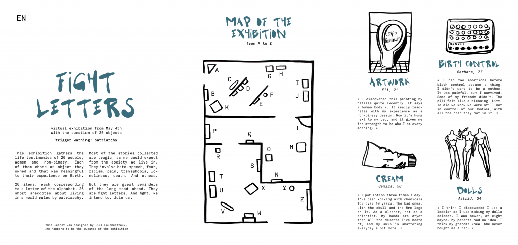
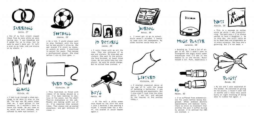
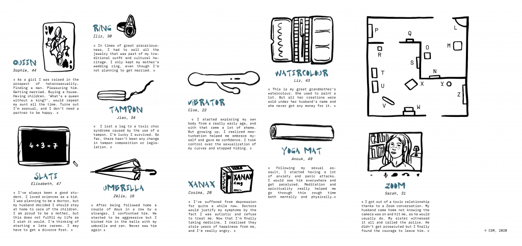
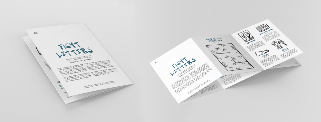
said leaflet is a 9-page foldable publication, with a poster on the back. i wish i could include a video of me manipulating it, but i don’t have a printer!! you’ll have to figure out how it works (clues in my process/research)

Such a thoughtful, creative piece of work. The illustrations and the pieces of writing go so well together. I love how you’ve been able to work round this brief to fit to the current situation. You’ve created a background for each one of your objects that could actually relate to the stories you’ve told. I really like the simplicity of the illustrations, they’re boldly presented and clear to understand. Picking objects that make up the alphabet was really cleverly done and adds to the clean and organised structure of your design. Even without looking at the process work, i can really get an understanding of what you concept is and where you’re coming from. Even still your process work is so in-depth, you had a clear idea at the start and strategically developed a great piece of design work.
I can’t really fault the work you’ve produced, as i think you’ve incapsulated the brief really well: Thought provoking, with such a strong message and design.
This is my favourite piece of work you’ve made so far. The illustrations are beautiful and well laid out on the page alongside the text, and I think the simple colour scheme helps to focus on the stories you’ve set out for us. Not only does it work really well visually, but the little stories / quotes beside the drawings are so human, it feels like i’m reading someones private texts rather than something that has been openly shared. There’s a sense of vulnerability to the piece which I think links well to what people are perhaps feeling across the world at the moment. I also like that in your process work you’ve tried out how it would work as a leaflet, and how it would open up. Maybe it would be interesting to try different ways of showing your work as so far the outcomes have all been leaflets / fold out designs. That’s just me really trying hard to think of improvements though! It’s a really great piece.
Your projects are always very illustrative, it is clear that you have a certain style as the aesthetic of your outcomes have been very cohesive which I think is really nice. The quotes that you’ve included although short, are very strong and tells powerful stories about these women. You must have spent a long time gathering these stories and it must have been quite the task to make them as ‘short and sweet’ as possible but you did a really good job. Your outcome seems very professional. I think theme, continuity and coherence plays a big part in why it all looks so good which means you made really amazing design choices – the fonts, colours, layout, etc. I could totally imagine this going in a magazine. I wish I could think of something to improve the work but I think you did an amazing job! The outcome seems very professional and sophisticated and I’m so impressed.
This is honestly such a well-planned and strong piece of work. From the mock ups, its evident that you have thoroughly considered the placements of both image and texts-none of them are intercepting through the margins and gutter. The typeface for ‘fight letters” looks amazing, it really emits the vibes of an artist or museum exhibition with a strong, distinctive visual identity. I also enjoy the fact that you’ve taken a completely different turn from the past two weeks from focusing on your childhood with more photographic methods to using these same items but altering their narratives. Each story has such vivid imagery as well-some with social commentary too. The usage of a restricted colour scheme allows the audience to balance their focus on both the stories and the items that tell them, its really effective.
In terms of suggestions, I agree what what Macey has mentioned, there are potentially other ways to present them (which you have evidenced in the floor plan) and despite it being in a leaflet, the spacing of the objects within one “section” works well in the fact that they all have their own “personal space” (what Zoom calls them). Other than that it is a splendid piece of work and I am hyped for your final outcome!